Otrapuse.lv UI UX Design
Online dating app
Project Background
Project year: 2016
Hansa Interactive wanted to transfer their online web dating experience over to mobile, keeping the same feel and usability of their web version, however the app should be user-friendly, easy to understand with quick on-boarding.
My role:
I was the core Visual Design Lead for Otrapuse.lv working closely together with Otrapuse.lv project manager. I participated and oversaw the creation of the design language and user experience, as well as stakeholder interviews to understand the business model and the user needs and wants.
50%
UX Research
100%
Interaction Design
80%
Visual Design
10%
UX writing
Discovery Phase
As there is already an existing platform of the services, it was key to draw out the features featured on the web version and how to transfer them to mobile. Using the information architecture of the existing data, the user experience research was based on quantitive research (looking at different dating apps & other analogous) and the feedback gathered from otrapuse.lv team.
Personas
From creating my own profile and engaging with some of the users of otrapuse.lv, I had a chance to discover a better understanding of the users who use the web services, which helped me create 4 different personas.
These personas allowed both me and the client to constantly be reminded of the people that we are designing the product for, their needs & wants, as well as pain points.
Design phase
Wire-framing &
Flow-Chart
After creating low fidelity prototype with all the features mapped out, the next step was to create a flow-chart of the user journey for all 4 personas to gasp a better understanding of the product and usability.
Iterations
During the development of the prototype on InVision, interviews with otrapuse.lv stakeholders we kept developing and evolving the design concept and the design language that fits the brand message on their online platform.
Final Design
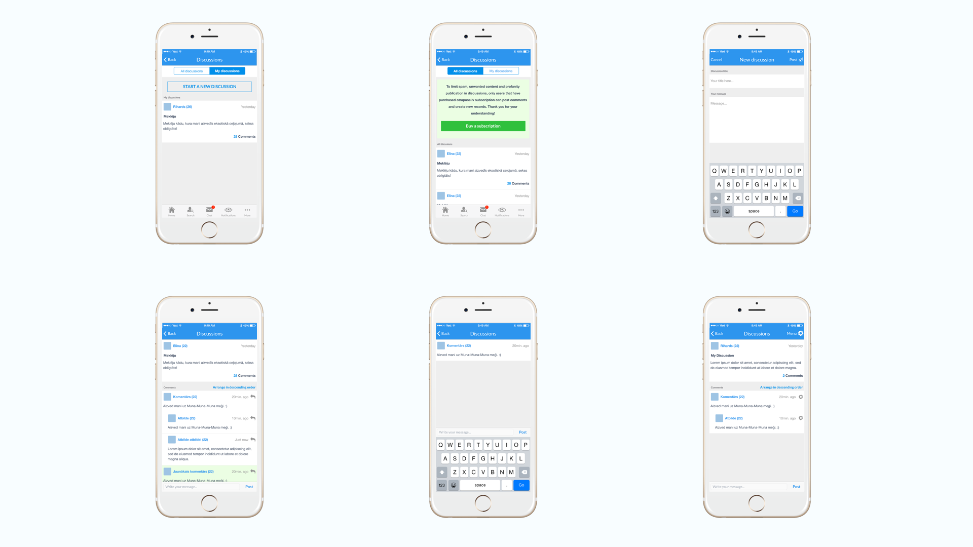
The final design was a process of 2 months of iteration and prototyping, coming up with a design language that both worked for Otrapuse.lv stakeholders and worked seamlessly with the online counterpart of the dating service.
The design revolved of bringing Otrapuse.lv on mobile platform without taking too big of risks of scaring the existing users, so that they can easily adapt the changes and migrate their habits from web to mobile.


