
PV Kompass & Stakis 2.0
Online portal for fast & easy car management
Project Background
Project year: 2018
PV Automotive & Stahlgruber wanted to start a new innovative workshop concept based on their previous systems. Seeking to appeal the next generation of workshop and garage owners, their goal is to make car management fast & easy for the driver and for the workshop.
By doing away the old understanding of their previous systems, but without loosing some of the core functions. PV Automotive & Stahlgruber hopes to radically transform their massive databases and partnerships into a value propositions, ensuring their relevance.
In phase one is to re-create the system from ground up to a working beta version.
My Role:
I was the core Visual Design Lead for PV Automotive for the project, working with 2 project managers and their core developers of the system.
I participated and oversaw the function integration phase, UX research phase, stakeholder interviews to understand business and user needs and wants.
Participated in decision making calls with the Project Lead, we developed the core Design Language System for PV:Kompass & Stakis. We also laid out a plan for future integrations to ensure flexibility, scalability and consistency across modules.
5%
UX research
65%
Interaction Design
80%
Visual Design
15%
UX writing
Discovery phase
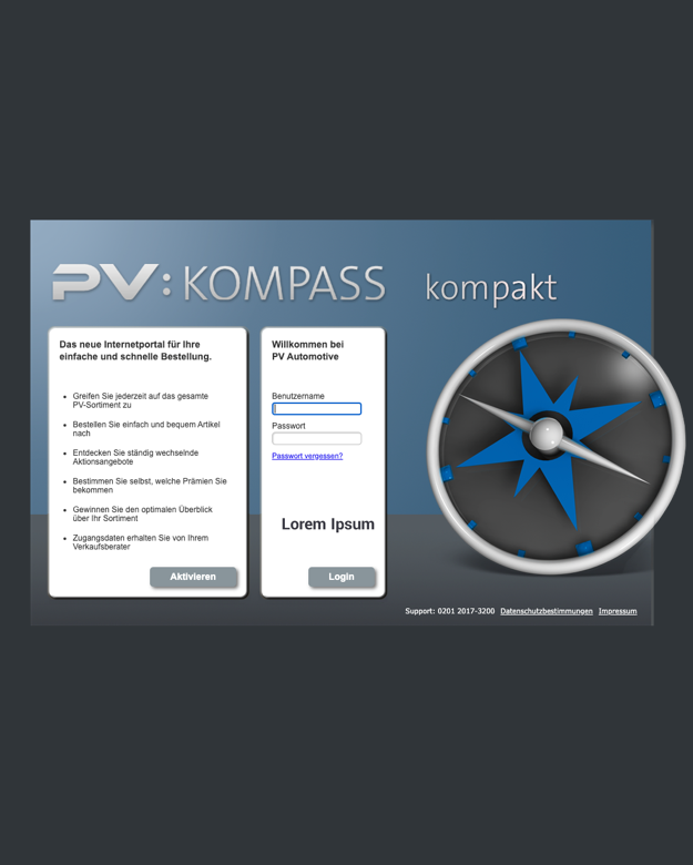
On-Boarding
As I was added to the team in the middle of the project, I first needed to conduct industry benchmarks on features, design styles and channels.
Researching the previous version, looking for analogs across the web and similar competitors in the auto industry.
This gave me a better understanding of the product, user and stakeholder needs as well as a good idea of what's available to customers now, and how we can do things better.

Stakeholder interviews
Most calls were with C-suite personal to get an understanding of how PV Automotive sees the future of their sub-brand PV:Kompass and their integration with Stakis in terms of brand identity and market position.
These interviews made clear what are the pain points in their current systems and gave me a better idea on how things could be improved.

Personas
After looking at the current system and what has been done so far, with the gathered data research I came up with 3 different personas that best could describe the demographics of PV:Kompass & Stakis target market.
From an experienced senior who doesn't use the newest technology, to a 25-35 year old male, who sees new technology a must.
These personas allowed both me and the client to constantly be reminded of the people that we are designing the product for, their needs & wants, as well as pain points.

Ideation workshop
We had weekly ideation workshops, where we discussed most of the features the product should have, creating a pitch ideas, we ranked them and eventually selected the best of them to include into a prototype or to develop them.
We kept a balance between the user needs and stakeholders vision.
Design Phase
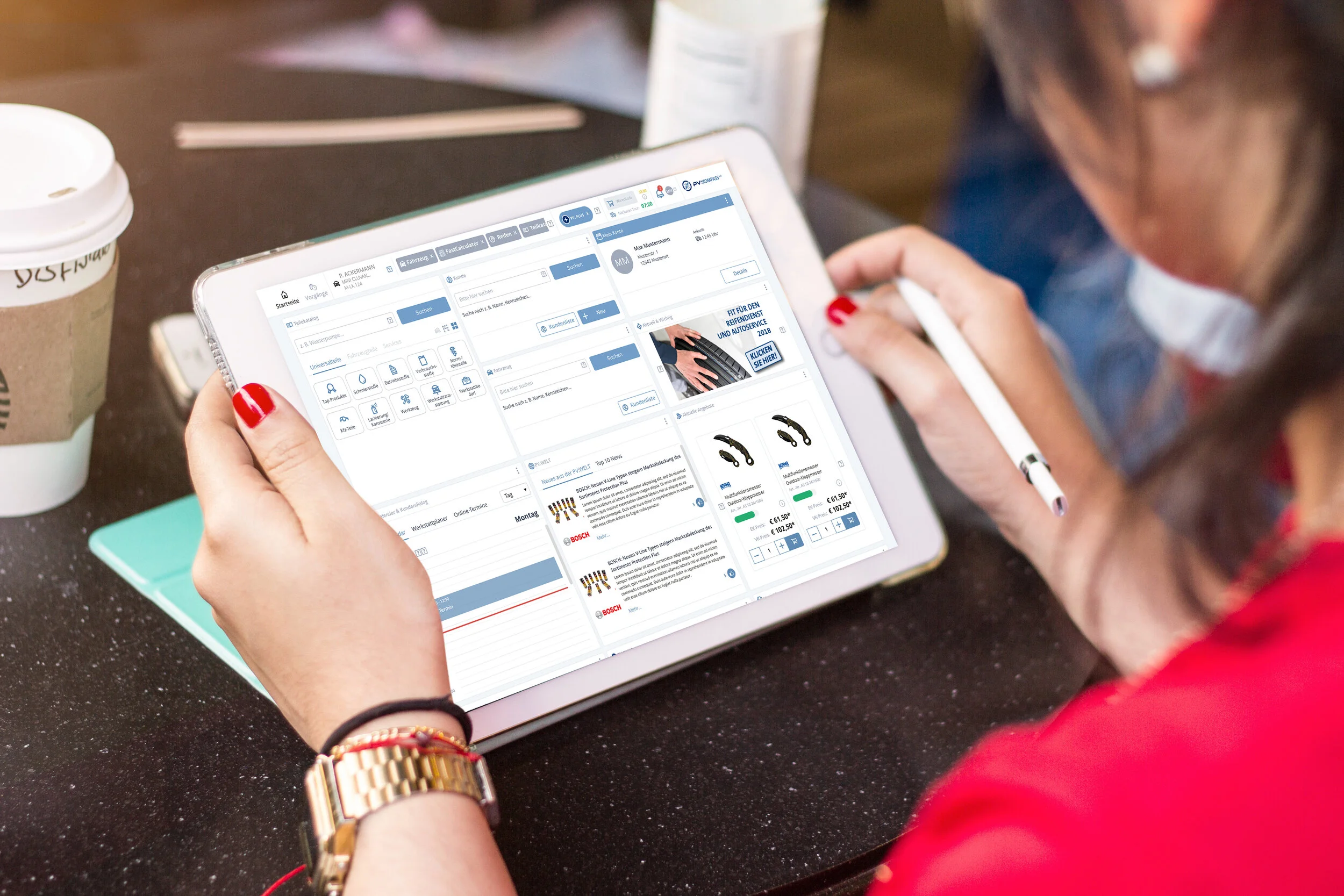
Based on our research and client requirements, the panel should work seamlessly on both Desktop and Tablet (mobile being a secondary option). This meant that while creating functions, we had to keep the design language that could work both desktop and mobile, choosing the right mobile language for extra functions was a must while retaining a sense of consistency in the user experience.

Conceptualisation
Based on research of industry design trends and competitor applications, we came up with few different approaches - each with their own strengths and capabilities.
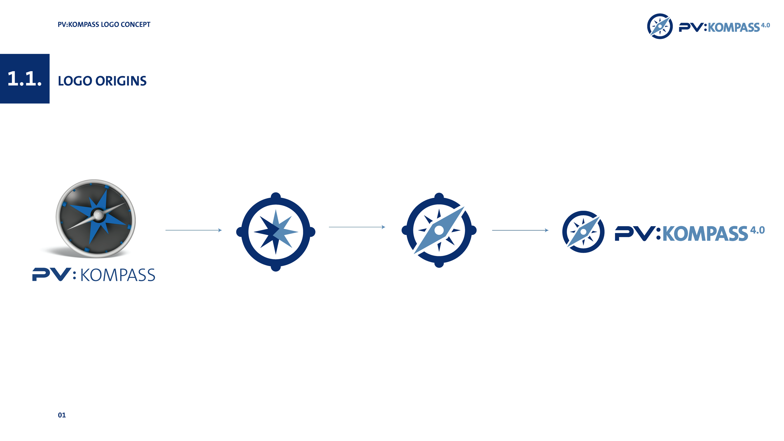
Since information architecture is key on this project, the harderst part I had to go thru was creating the main navigation and picking the right colour-scheme that fits for PV:Kompass and later can be transferred to Stakis.

Prototyping
Based on the information architecture, together with the stakeholder we went with a low fidelity prototype on InVision to understand which approach will go best with one of the created concepts.
This gave me the ability to quickly come up with basic design language and usability guidelines and how to create components.

Iteration
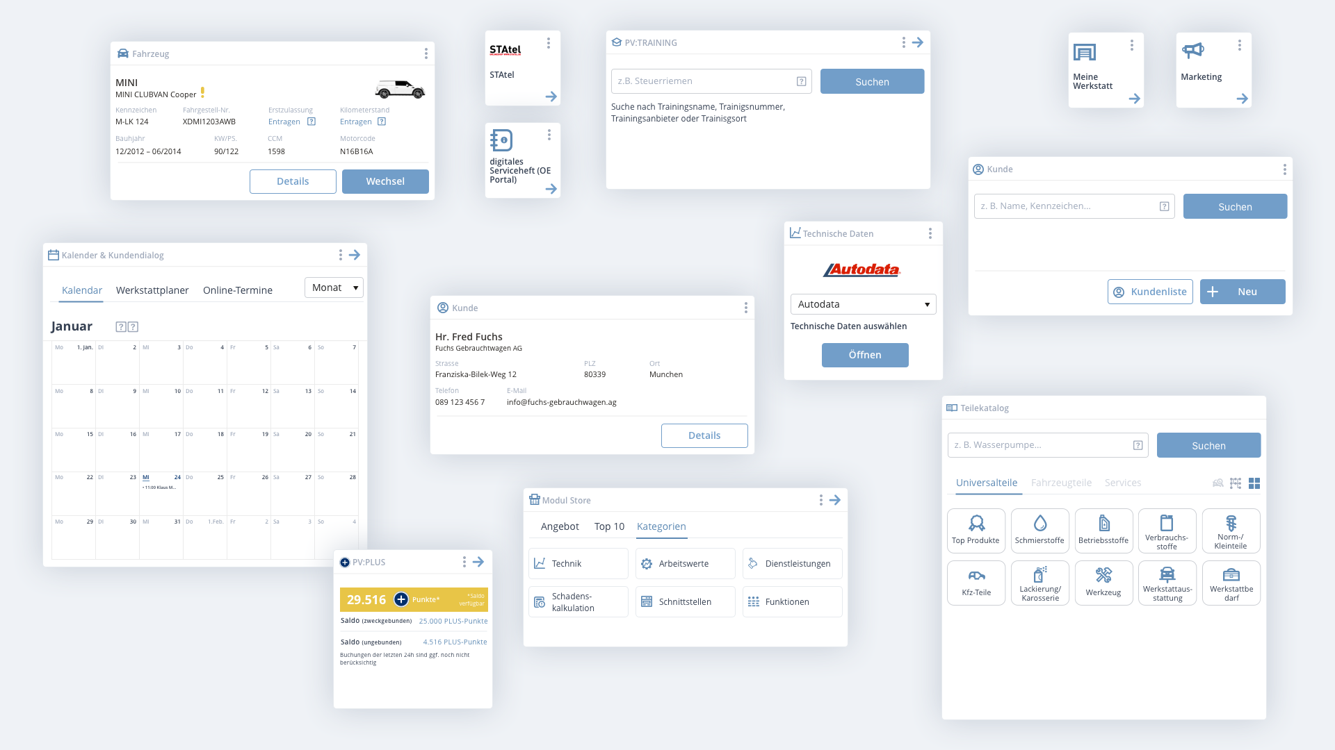
During the data collection & meetings, as well as client feedback, we kept developing and evolving the design concept and the design language, adding features of tiles that can be resized and moved around to personalise the PV:Kompass dashboard.
There were more than 10 iterative improvements after each feedback.
User testing
During the prototype creation, some of the features were delivered by the developer team, where functions were tested which helped me to get feedback on the usability, navigation and features. This was a crucial step in designing a system that users liked using and would return using it.
Final Design
The final design was the result of months of iterations and testing, coming up with a design language that both worked with PV Automotive and Stahlgruber, even updating the brands of both systems.
The designs revolved around the concepts of flexibility, clarity and usability – these were achieved thought the use of a light and bright color palette, card-based/tile-based design with modular blocks.